How to Coordinate Partition Colors with Your Office Decor
Posted by Kate Murphy on Aug 8th 2025
Let’s be honest: most people don’t walk into an office and comment on how perfectly the partition colors complement the accent rug. But they do notice when something’s off—like a lime-green divider clashing with rusty-orange walls and navy-blue polka-dot chairs. A thoughtfully coordinated workspace doesn’t just look nice, it shapes how employees feel, collaborate, and perform.
In this guide, you’ll learn how to coordinate office partitions with your decor in a way that’s both aesthetically pleasing and purposeful—blending function with flair. Whether you’re outfitting a law firm or launching a hip startup, Versare has got the color strategies to match.

The Importance of Cohesive Office Design
Numerous studies and reports confirm that a well-designed office isn’t just for show. Thoughtfully designed environments support better focus, reduce stress, boost collaboration and creativity, increase job satisfaction, and help attract and retain top talent.
Office partitions are often installed for practical reasons—creating private work areas, managing acoustics, or defining zones in open-concept layouts. But they also add substantial visual weight to a room. Choosing the right color for your partitions ensures they contribute to your space’s vibe rather than disrupt it.
Identifying Your Office’s Color Palette
Before choosing colors for your room dividers, take stock of your office’s existing palette. Start by identifying:
- Dominant colors: The largest surfaces and furnishings, like walls, floors, and desks
- Accent colors: Smaller decorative items such as rugs, artwork, plants, or signage
From there, a quick dive into color theory will help guide your next steps:
- Warm tones (reds, oranges, yellows) energize and stimulate—perfect for collaborative zones or creative departments
- Cool tones (blues, greens, purples) promote calm, focus, and clarity, making them ideal for heads-down workspaces or meeting areas
- Neutrals (gray, beige, white, black) provide balance, flexibility, and contrast that support or highlight other colors
Matching or Complementing Your Office Decor
Color coordination isn’t just about what looks good, it’s about what works for your space. When selecting office partition colors, you’ll want to decide whether to match your existing decor or complement it with a contrasting tone. Both approaches are valid—it all depends on the mood and function you want to create.
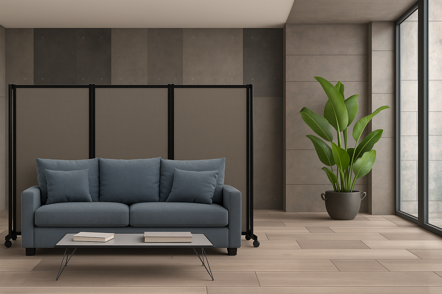
Matching means choosing partition colors that closely align with your existing palette by using the same tones. If your office features soft grays, for example, a slate gray partition will blend in effortlessly. This creates a cohesive, uniform look that’s ideal for traditional, minimalist, or highly professional spaces where consistency and subtlety matter.
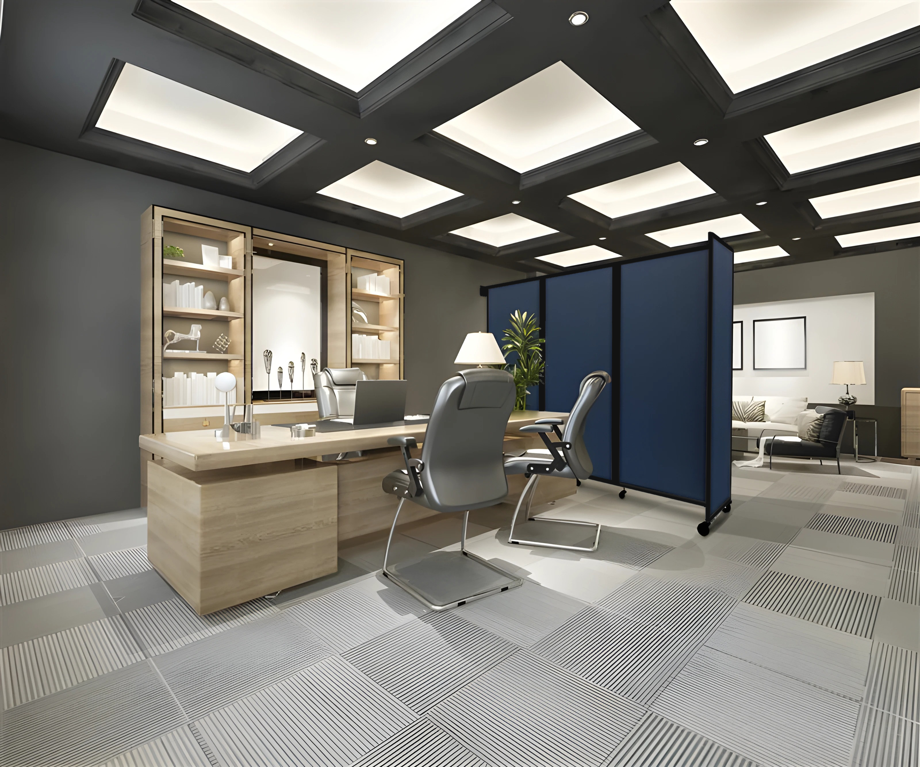
Complementary colors are pairs of colors that are located directly opposite each other on the color wheel, creating a strong contrast when used together. Think navy partitions in an office with orange-tan furniture, or muted sage-green decorations against blush-toned walls. This approach adds personality without becoming a distraction.
When deciding between bold and neutral tones, consider the tone of your workspace. In formal or corporate settings, it's best to stick with neutral or desaturated colors like charcoal, gray, taupe, or navy. These shades convey professionalism, create a sense of order, and avoid unnecessary visual distraction. On the other hand, creative or casual environments benefit from brighter, more saturated hues—such as cobalt blue, teal, or burnt red. These colors can energize the space, spark creativity, and promote a more dynamic, collaborative atmosphere.
You can also use contrasting colors strategically to create focal points, define activity zones, or subtly guide movement—like placing a row of vibrant partitions near collaboration areas or entry points.
Consider the Divider’s Purpose and Placement
The color of your office partition should align with how—and where—it’s being used. Different functions call for different visual cues.
For private meeting areas or quiet zones, opt for darker or muted tones like navy or charcoal. These shades absorb light and help create a calm, enclosed feel. In contrast, open-concept spaces benefit from lighter or neutral colors that maintain a sense of openness while subtly defining zones.
In creative or collaborative areas, consider bolder hues like teal or red to energize the space and spark engagement. And for client-facing or branded areas, choose colors that reflect your identity—either through tone or custom finishes.
Color also plays a role in guiding traffic flow. Consistent tones can define pathways, while contrasting dividers at key points, like entrances or transitions, can subtly signal changes in activity. Used well, color supports both navigation and function without overwhelming the space.

Align with Branding and Company Culture
Office partitions can do more than divide space—they can quietly reinforce your brand identity. The colors you choose reflect your company’s personality, values, and work environment. With the right approach, partition colors become an extension of your overall branding and office setting.
A tech startup, for example, might choose bold, energetic colors like electric blue, teal, or orange—shades that signal innovation and creativity. These tones reflect a fast-paced, collaborative culture.
A law firm or financial office is more likely to favor classic, subdued hues like charcoal, navy, or forest green, which convey professionalism, trust, and stability.
Nonprofits or wellness-driven organizations often gravitate toward natural, calming tones such as soft greens or warm earth colors, helping to create a peaceful, welcoming environment aligned with their mission.
If your company has a signature color, consider using it—or a complementary shade—on your partitions to tie the space together. Whether bold or conservative, your color choices should reflect your brand’s identity and reinforce the culture you want to cultivate.
Popular Office Partition Colors and What They Convey
The top room divider color choices at Versare—cloud gray, charcoal gray, ocean, slate, and powder blue—aren’t just customer favorites by chance. These hues have become go-to options for a reason: they’re versatile, professional, and effortlessly modern.
Below, take a closer look at why these shades continue to dominate office spaces—and explore a few unique options for those looking to make a bolder statement.
Blue Partitions
Like a clear sky or a calm ocean, blue evokes a sense of serenity and calm that helps quiet the mind. This soothing effect promotes mental clarity, allowing you to feel more focused, energized, and productive throughout the day. Because of these qualities, blue is a popular choice for office environments aiming to boost concentration and reduce stress.
Its trustworthy and dependable quality makes blue especially well-suited for spaces where important decisions are made—such as meeting rooms, research areas, and brainstorming zones.
Gray Partitions
Gray is the ultimate professional neutral—balancing style and sophistication without overpowering your office space. Incorporating gray decor and gray partitions creates a polished, modern backdrop that complements almost any design or color scheme.
Its versatility makes gray ideal for a wide range of workplaces. It conveys stability and reliability while promoting focus and calm, helping teams stay productive without distraction. Neutrals shine everywhere, but especially in areas like lobbies, breakrooms, or open meeting spaces with ample natural light.
Green Partitions
Symbolizing nature and tranquility, green is easy on the eyes and helps reduce fatigue. It promotes balance, calm, and creativity—making it an ideal choice for spaces where employees need to stay focused and inspired throughout the day.
If your team works long hours, needs a calming environment, or just wants to embrace biophilic design, consider incorporating tall plants and green partitions in individual workstations, lounges, or reception areas.
Other Colors and Custom Design Partitions
While blue, gray, and green remain popular choices for office partitions, the world of color options extends far beyond these classics. From purple to papaya, there’s a vast spectrum of hues available to suit any office aesthetic or brand personality. Choosing colors outside the traditional palette can help your workspace stand out, inspire creativity, or simply reflect a more personalized, dynamic environment.
If you don’t see the exact shade you want, try out the custom-printed Room Divider 360®. You can incorporate your company’s logo, specific brand colors, or even full graphics directly onto the office partition panels. Customization allows you to turn a functional element into a bold statement piece that reinforces your identity and values.
Make Functional Furniture Work for You
Office partitions serve a dual purpose: they shape your workspace physically and aesthetically. Choosing the right color allows them to blend into your office design or stand out in intentional ways. And at the end of the day, it's about creating an office that works as hard as your team does—functional, polished, and aligned with your brand.
Ready to bring style and structure to your space? Browse the Office Partitions page or reach out to Versare for help finding the perfect fit and color. Experts are available to help make your office feel—and look—like a well-oiled machine.


