
Hack Your Office Space: 5 Color Psychology Secrets to Supercharge Your Team
May 16th 2024
Color is a silent superpower in our daily lives, influencing us more than we imagine. Numerous studies have revealed that color psychology isn't just about aesthetics; it can significantly boost productivity, efficiency, mood, and more for you (and your team!). Imagine transforming your office from a bland box to a vibrant hub of creativity and focus, simply by harnessing the power of color. Well, imagine no more — here’s your guide to color psychology, how certain colors can enhance your office environment, and four recommended design integrations from Versare.
Color Psychology 101
Let's explore the science behind color. Color psychology delves into the impact of various colors on human mood and behavior. It investigates how colors can sway emotional reactions and how individual responses to color are shaped by factors like age and cultural upbringing, too.
Specific colors can trigger certain reactions in us, influencing factors like focus, creativity, and even communication. By understanding these connections, we can design spaces that promote specific vibes, transforming our offices from uninspiring blah to productivity powerhouses.
Five Color Schemes for Your Corporate or Home Office
So, which colors reign supreme in the office arena? Here are five fantastic options, each bringing its own unique set of benefits.
Neutrals are a go-to choice for office interiors for a reason — they never go out of style! These colors (white, gray, and beige) don't clash with bolder accents, fostering an environment of peace, collaboration, cleanliness, and professionalism. Neutrals shine in areas like lobbies, breakrooms, or open meeting spaces with ample natural light. They create a calming foundation that you can personalize with pops of color for a playful mood or keep things sleek and minimalistic by using neutrals all-together.
Give a “rah-rah” for red — this “warm” color evokes feelings of excitement, energy, motivation, and determination. Did you know this bold color also increases heart rate, breathing, and appetite? Since it’s a powerhouse color, use it sparingly with muted tones or as accents through furniture, desk accessories, and wall decor. This approach injects confidence and boldness without overwhelming employees. Ideal locations for red pops include cafeterias, hallways, or late-night workspaces.
Yellow is a mentally stimulating tone that enhances cognitive function and ignites a curious, intellect-driven mindset. It exudes feelings of positivity and optimism, creativity, and clarity. Say “hello” to yellow with accents in high-energy areas where creativity thrives — design studios, developer hubs, and writer havens. Or sprinkle pops of yellow with desk or wall accessories, planters, or even chairs and couches.
Blue is the undisputed king of “cool” colors, renowned for its ability to evoke feelings and thoughts of peace, tranquility, calmness, and dependability, making it ideal for areas where focus is key. In fact, it’s considered to be the most effective at promoting productive workspaces, like meeting spaces, research and reporting rooms, and brainstorming zones.
Another member of the “cool” family, green reigns supreme in nature, symbolizing serenity and growth. Not only is it considered the most restful color for the human eye, but it also promotes harmony, balance, and a touch of optimism. If your workplace is used to long work hours, consider going green — this calming color reduces anxiety and the above mentioned eye strain, making it ideal for individual workstations, employee lounges, and reception areas.
Beyond Paint: Four Colorful Design Solutions
Whether you're embarking on a full office makeover or simply craving a refresh, remember that color isn't limited to paint! Room dividers, cubicles, acoustic wall panels, and modular office furniture offer a fantastic way to incorporate pops of color and functionality. Here's where design meets purpose:
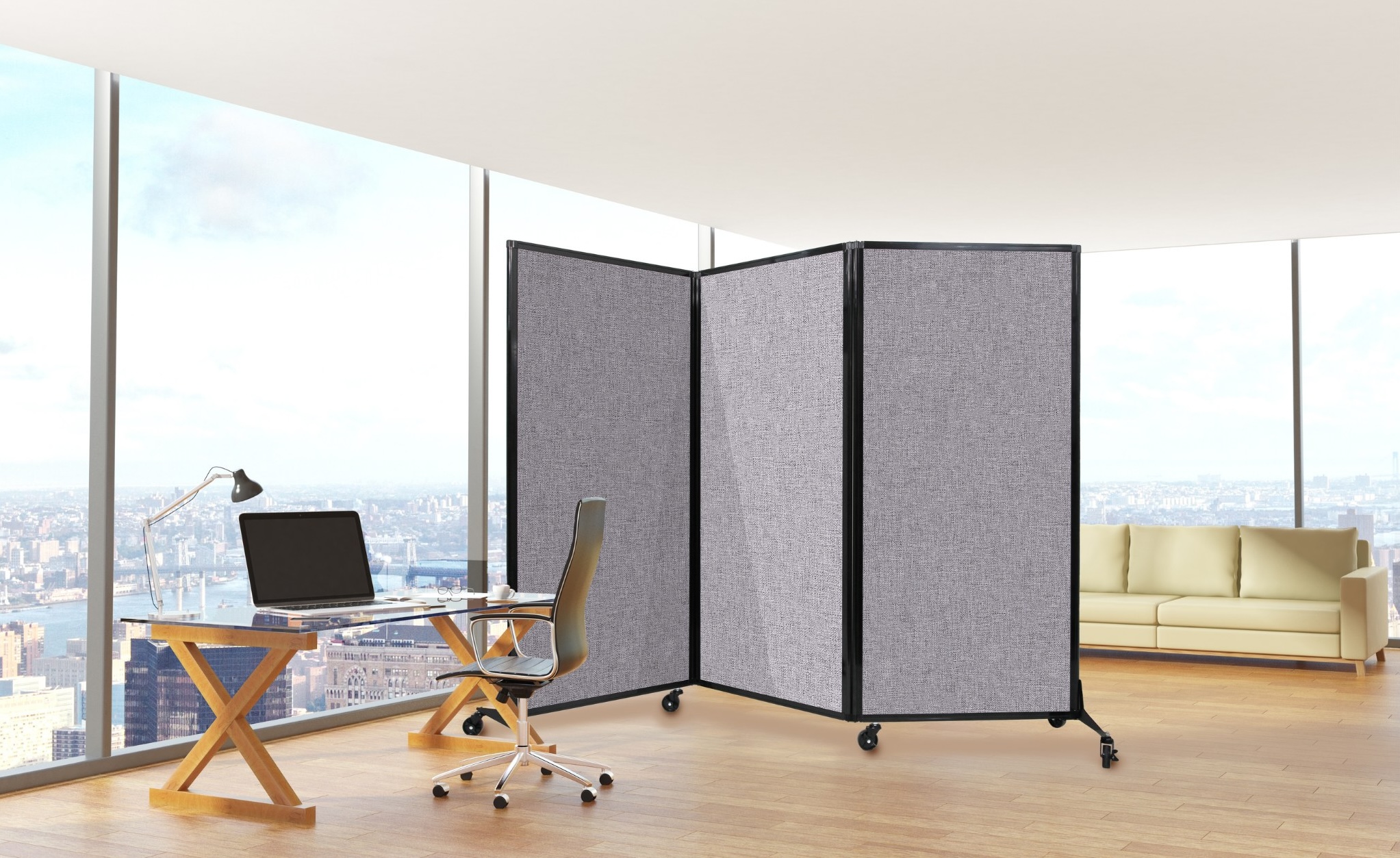
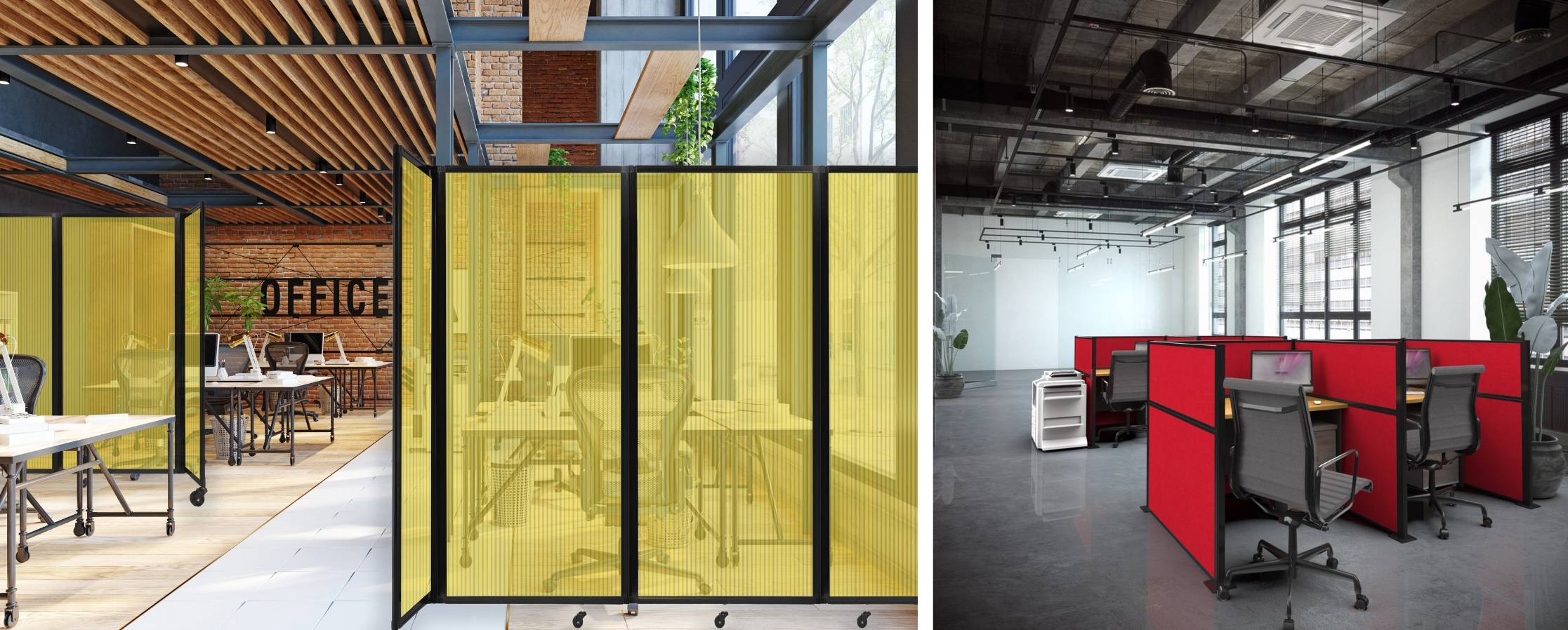
- Room Dividers: Create designated work zones or collaboration areas with colorful or marvelously muted room dividers.
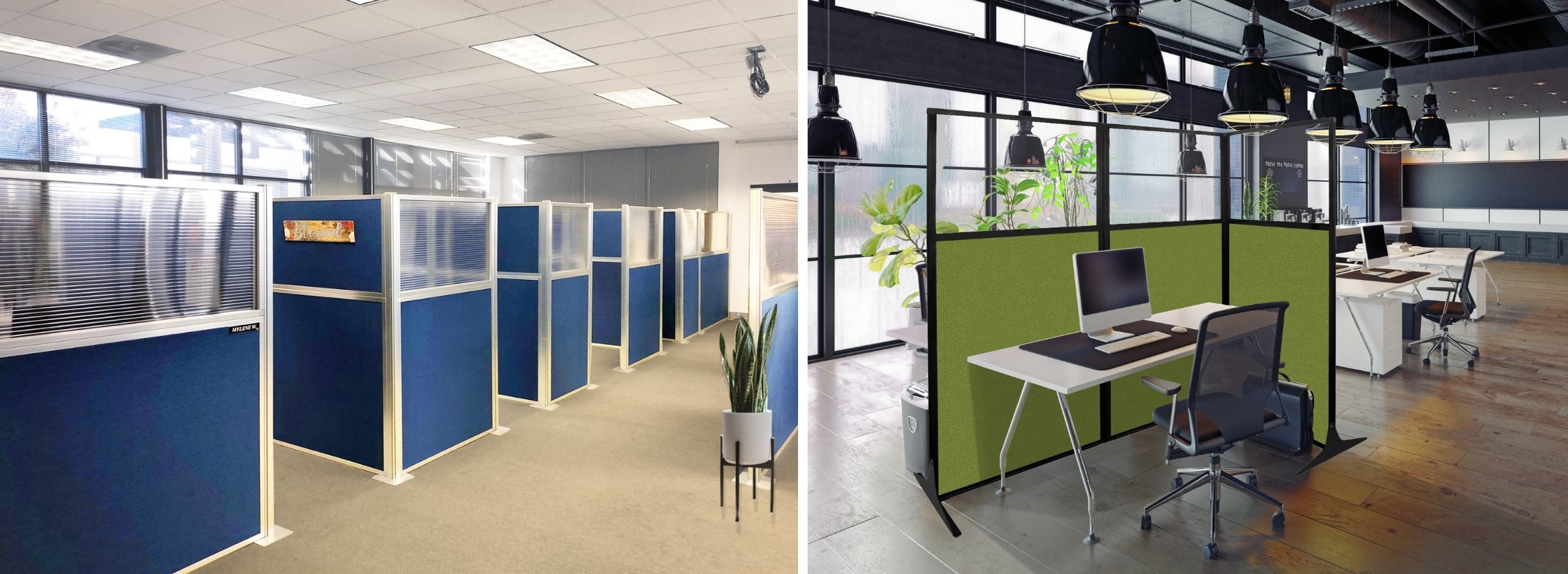
- Cubicles: Spruce up traditional cubicles with pops of color on cubicle walls. Our cubicles come in neutral colors and blue hues, but thanks to their tacklable surfaces, you can pin, tack, and post photos, signs, and artwork.
- Acoustic Wall Panels: SoundSorb™ acoustic panels not only dampen sound for better communication, but they also come in an array of neutrals and a bold blue. This allows you to embrace color psychology while addressing sound management — a win-win!
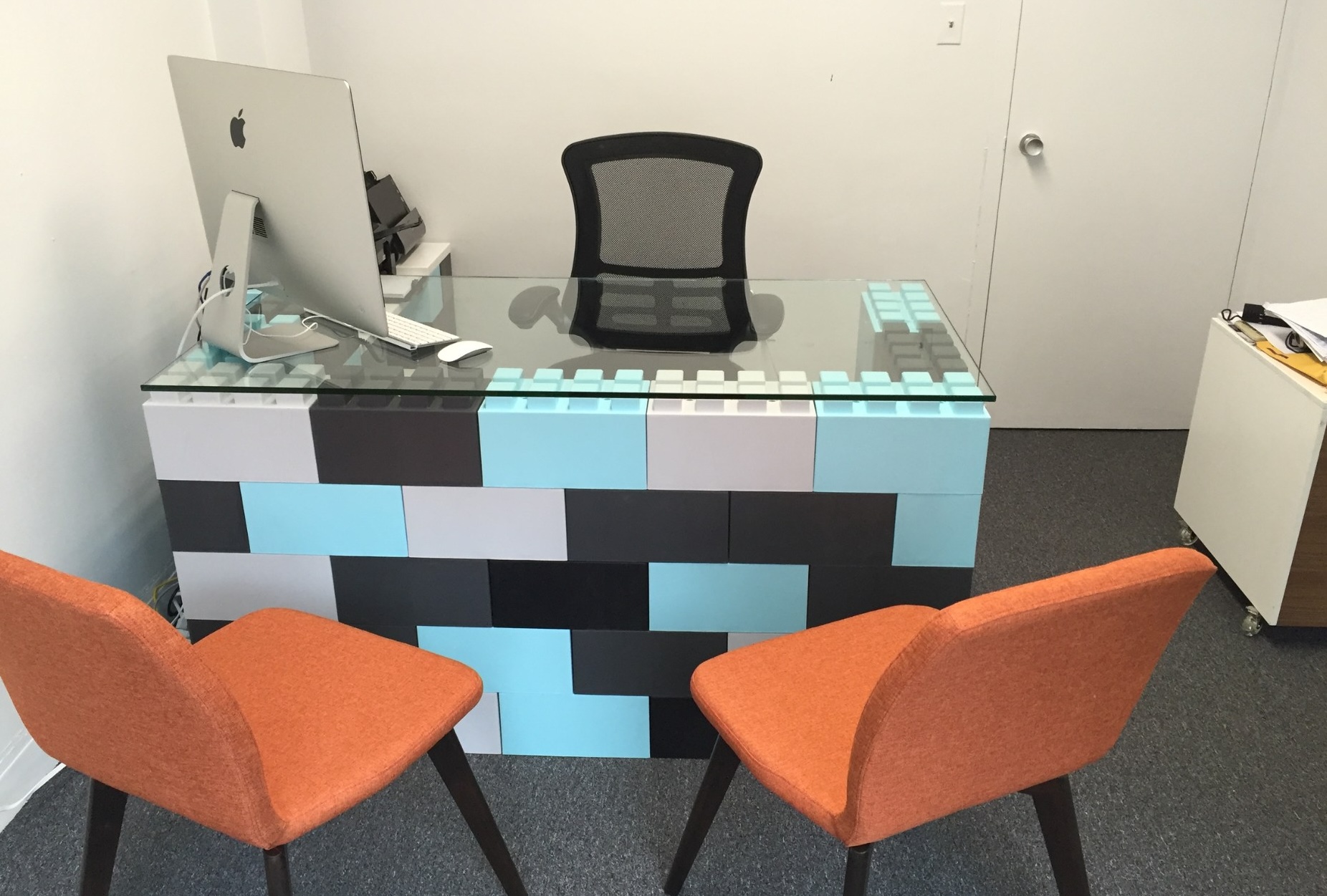
- Desks and Shelves: Punctuate your space with EverBlock® Shelving and Desk Kits. The recyclable blocks (in 13 hue-tiful colors) are an effortless way to incorporate beautiful, sustainable, and sturdy modular furniture.
Design Colorful Spaces with Versare in Mind
Any steps you can take to improve productivity, mood, and efficiency (from fresh coats of paint to office furniture, partitions, and wall panels) are well worth the investment. Incorporate color psychology into your office design by shopping our website. Need more assistance? Simply reach out to Sales@versare.com or give our call center a dial at 855-323-8126.